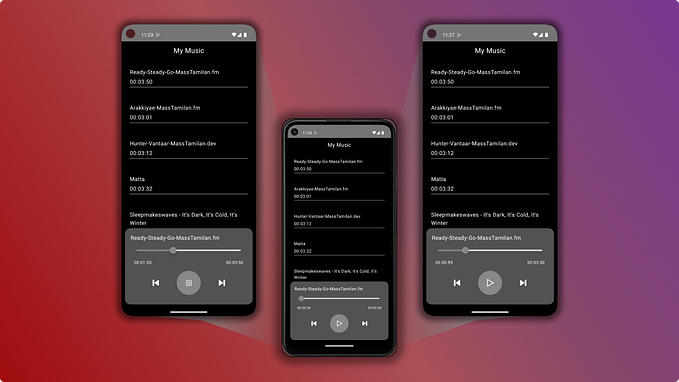
Jetpack Compose — Building a RecyclerView with StickyHeader

Reasons behind Jetpack Compose
Jetpack Compose is the new way to implement layouts in Android using Kotlin allowing for dynamic and smart features, replacing the static XML Layout files used to build Android UIs until now.
The reasons? Android XML Layouts are bulky...
- XML Layout files are static, which means
- you had to define numerous variations of the same XML layout depending on your device size and its orientation.
- Accessing the UI Elements is a pain, with the default way to access UI elements (
findViewById) to have an impact on performance. As a result, several alternatives have been introduced to access directly the UI components, from Kotlin Synthetics to ViewBinding and DataBinding. - Allowing for decision making in UI Elements is also a pain. To add extra logic and functionalities to UI Elements you have to create BindingAdapters in separate Kotlin files. And for harder scenarios, like building a RecyclerView? Well in that case you had to build a complex Adapter with ViewHolders because you cannot fit logic inside your layout.
Classic RecyclerView
In classic RecyclerView consider the amount of code that is required for the XML Layout for the RecyclerView itself and its row. Then you have to write a large Adapter class with a ViewHolder, and to increase efficiency you have to use DiffUtil, ending up in a mammoth code.
So, a classic RecyclerView contains lots of lines of code, but we can achieve the same functionality (and even more - like Sticky Headers which are not found in RecyclerView) with just a fraction of that code with Jetpack Compose.
So let’s simplify Android Development by using Jetpack Compose and build a powerful RecyclerView equivalent with just a few lines of code!
Stages of the project we are about to Build

Before attempting the project, make sure you have the latest version of Android Studio (as of now, Arctic Fox), which is available at the Stable Channel.
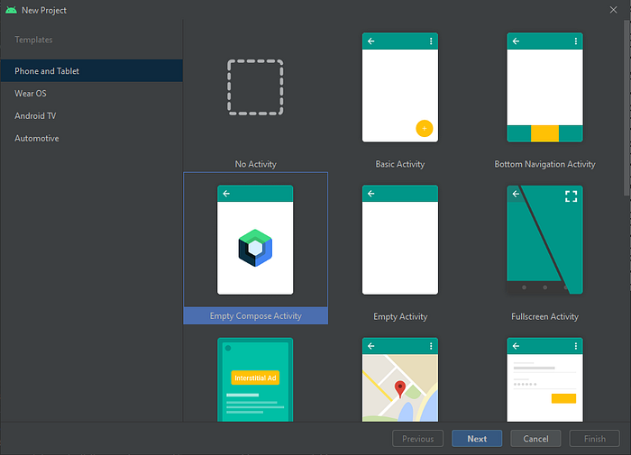
With that version of Android Studio, when creating New Project, you should see the option “Empty Compose Activity”, select that.
NOTE: For our demos, name your project “ComposableApp” for the copy/pastes to work, or read the “important note” at the beginning of the Demo 1 project.
PART A: Basic Project
For the basic part, we will create a for-loop in which we will display cells with static text
- [Demo 1] We will start with a ListView equivalent in Jetpack Compose
- [Demo 2] We will then continue to its RecyclerView Equivalent
- [Demo 3] Then we will put click listeners to our RecyclerView items
PART B: Improved Project
We will then take this further by using a data set with a list of Person objects, where we will use Coil to display online images
- [Demo 4] We will create an improved layout where we will display data and images in a LazyColumn (RecyclerView) from a Data Set.
- [Demo 5] We will then add Sticky Headers to our LazyColumn (RecyclerView)
PART A: Basic Project
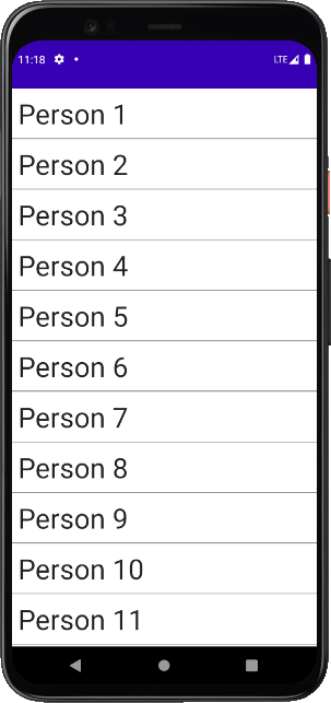
Jetpack compose provides you Columns, Rows, and Boxes. You can think of Columns and Rows as LinearLayout containers with their items aligned vertically and horizontally respectively, and Boxes as the RelativeLayout equivalent.
Demo 1: “Column” — a ListView Equivalent
In the first approach, we will use something similar to the old Android’s ListView.
We will create 200 Text objects stacked vertically inside a scrollable Column.
- At your
onCreatemethod create a call to our composable function
IMPORTANT NOTE:
TheComposableAppThemeblock has this name because we named our ApplicationComposableApp(if we named itWhatever, this block would be namedWhateverTheme), so know this if you named your project differently.
setContent {
    ComposeAppTheme {
        Surface(color = MaterialTheme.colors.background) {
            ScrollableColumnDemo()
        }
    }
}
2. Then add your composable function here
@Composable
fun ScrollableColumnDemo(){
    val scrollState = rememberScrollState()
    Column(
        modifier = Modifier
            .verticalScroll(scrollState)
            .fillMaxSize()
    ) {
        for (i in 1..200){
            Text(
                text = "Person $i",
                fontSize = 36.sp,
                modifier = Modifier.padding(8.dp)
            )
            Divider(color = Color.Gray, thickness = 1.dp)
        }
    }
}
Let’s examine the code…
- We create a Text followed by a Divider composable object, two hundred times inside a for-loop.
- These composable components are nested inside a Column composable component, which is the equivalent of a vertical
LinerLayout. - For this Column to be scrollable, we need to declare a
verticalScroll(scrollState), which is the equivalent of attaching aLinearLayoutto aScrollView.
The above approach suffers from performance issues as we create all the UI, even for elements outside the viewable area, which is how ListViews work.
RecyclerViews exist to address that problem, so let's see how we can improve that code.
Demo 2: “LazyColumn” — a RecyclerView Equivalent
Normally when adding features, the complexity and the amount of our code increase.
However, switching from ListView to RecyclerView equivalent in Jetpack Compose, the code will decrease!
- At your
onCreatemethod change yoursetContentcall fromScrollableColumnDemo()toLazyColumnDemo().
setContent {
    ComposeAppTheme {
        Surface(color = MaterialTheme.colors.background) {
            LazyColumnDemo()
        }
    }
}
2. Then add your LazyColumnDemo() composable function
@Composable
fun LazyColumnDemo(){
    LazyColumn(){
        items(200){
            Text(
                text = "Person ${it+1}",
                fontSize = 36.sp,
                modifier = Modifier.padding(8.dp)
            )
            Divider(color = Color.Gray, thickness = 1.dp)
        }
    }
}
A LazyColumn will display only the UI elements that occupy the available viewable area, and with a built-in scrolling mechanism, it will emit any new components that enter the viewable area as the user scrolls.
In a nutshell, this is how a RecycleView works, with the exception that a RecyclerView recycles components moving out of the viewable area, while the LazyColumn doesn’t. However, LazyColumn is still performant as emitting Composables is relatively cheap compared to instantiating Android Views.
And because, as mentioned, the LazyColumn has a built-in scrolling mechanism, you don’t need to define verticalScrolling anymore, which results in less code compared to the first approach.
In LazyColumn’s items, you can either define
- how many times you loop for some fixed functionality (this is what we do in Demo1, Demo2, Demo3),
- or a list of items (which you would normally do with data coming from some repository — we will use that in Demo4 and Demo5).
Note: the it represents “the current item”. In our case, since we defined a count of items (and not a dataset), it represents the current iteration, and thus it returns the iteration number. So for our items(200), it will return values between 0 and 199.
Demo 3: LazyColumn with Click Listener
In this demo, we will take the Demo2 example and add a click listener for its items!
- At your
onCreatemethod create a call to our composable function
setContent {
    ComposeAppTheme {
        Surface(color = MaterialTheme.colors.background) {
            LazyColumnClickableDemo{
                Toast.makeText(
                  this, "Person $it", Toast.LENGTH_SHORT).show()
            }
        }
    }
}
2. Then add your composable function here
@Composable
fun LazyColumnClickableDemo(selectedPerson: (Int) -> Unit){
    LazyColumn(){
        items(200){
            Surface(
               modifier = Modifier
                    .clickable {selectedPerson(it+1)})
            {
                Text(
                    text = "Person ${it+1}",
                    fontSize = 36.sp,
                    modifier = Modifier.padding(8.dp)
                )
                Divider(color = Color.Gray, thickness = 1.dp)
            }
        }
    }
}
At (2) we added a lambda function called selectedPerson, that takes an integer as an argument.
So now at (1) we can open a block that implements the callback of our item click, and display a Toast message with the person’s number.
Now to make all this happen, we introduced a Surface and put our Text and Divider objects inside it. We made this surface clickable through its Modifier property, and on-click we pass the current iteration number to our lambda function, thus returning the current item number.
PART B: Improved Project
Prerequisites
Here, instead of looping statically, we will provide a list of 200 Person objects through an ArrayList to our LazyColumn.
Let us first define a data class for the Person class:
data class Person(
    val id: Int,
    val section: Int,
    val name: String,
    val imageUrl: String,
    val landingPage: String
)
We will make 200 object instances of that data class to mock real data retrieved from a repository.
Every person will belong to some section. We want this so at Demo5 we can display Sticky Headers of sections for our persons. After every 15 constructed persons, we increase the section number to mock that.
So persons 1..14 will belong to section “1”, persons 15..29 to section “2”, person 30..44 to section “3”, and so on.
val persons = arrayListOf<Person>()
var section = 1for (i in 1..200){
    if (i % 15 == 0){
        section++
    }

    persons.add(
        Person(
            id = i,
            section = section,
            name = "Ioannis Anifantakis",
            imageUrl = "https://anifantakis.eu/wp-content/uploads/2021/05/ioannis-anifantakis-firebase-small.jpg",
            landingPage = "https://anifantakis.eu"
        )
    )
}
We will Display our Images from the network using the Coil library for Jetpack Compose.
Add the dependency for Jetpack Compose Coil support as shown below at your app-level Gradle file, and sync.
implementation("io.coil-kt:coil-compose:1.3.2")Demo 4: LazyColumn with improved UI and provided dataset
Here we will create the layout of each cell, and use it inside our LazyColumn for each item to display.
1. Define the Image Loader
@Composable
fun ImageLoader(imageUrl: String){
    Image(
        painter = rememberImagePainter(imageUrl),
        contentDescription = null,
        contentScale = ContentScale.Crop,
        modifier = Modifier.size(120.dp)
    )
}
Here we created a function that holds an Image.
Much like with a BindingAdapter (if you were using XML Layouts with DataBinding), here we create a function that takes a URL as a String parameter and uses the Coil’s rememberImagePainter method for Jetpack Compose to asynchronously download the image from the network and display it, cropped and at a 120x120 dp size.
2. Define the ListItem
@Composable
fun ListItem(person: Person, selectedPerson: (Person)->Unit){
    Card(
        modifier = Modifier
            .padding(8.dp)
            .fillMaxWidth()
            .clickable {selectedPerson(person)},
        elevation = 8.dp,
    ) {
        Row{
            ImageLoader(person.imageUrl)
            Spacer(modifier = Modifier.width(8.dp))
            Text(
                person.name+' '+person.id,
                style = MaterialTheme.typography.h5,
                modifier = Modifier.padding(8.dp)
            )
        }
    }
}
Ok, you can think of this method as the ViewHolder and its binding together.
The ListItem method takes a Person instance, so it can display information about that person, and a lambda, which is used as a delegate to pass that Person object back to the caller when we click on that ListItem.
We use a Card that is slightly elevated (8dp), utilizing the Material Design principles, with 8dp padding between each different card.
In that Card, we define a Row (that is like a horizontally aligned LinearLayout), so we place on the left the Person image and on the right the Person name.
We use a Spacer between the image and the name, to add 8dp of space between the two horizontally aligned elements.
3. Populate ListItems for each ArrayList entry to our LazyColumn (RecyclerView)
@Composable
fun LazyColumnClickableAdvDemo(persons: List<Person>, selectedPerson: (Person)->Unit){
    LazyColumn(){
        items(
            items = persons,
            itemContent = {
                ListItem(
                   person = it,
                   selectedPerson = selectedPerson
                )
            }
        )
    }
}
This is our classic LazyColumn
Instead of putting all the code inside the items block, we split it into the composable methods defined earlier, but we could as well put it all in a single function.
So what’s different here?
- We pass a list of Persons (
persons: List<Person>) to our composable method that contains theLazyColumn. - As we are passing a list of Persons to our
itemsblock (instead of iterating statically 200 times like before), we define theitemsto be the list of persons (items = persons). - Thus the
itnow does not represent the current iteration number of the loop, but the current Person instance of the provided PersonsList. - Our lambda parameter (
selectedPerson: (Person)->Unit) instead of returning an integer, it will now return an instance of a Person object.
4. Add it to the setContent of our Activity
val persons = arrayListOf<Person>()
...
...
...setContent {
    ComposeAppTheme
        Surface(color = MaterialTheme.colors.background) {

           LazyColumnClickableAdvDemo(persons){
                Toast.makeText(
                    this, "${it.name} ${it.id}",
                    Toast.LENGTH_SHORT
                ).show()
            }
        }
    }
}
Here, like always we are calling our Composable Function from the setContent block on our onCreate method.
However, we now pass as a parameter the list of persons to that composable function, and because the click event returns a Person instance, the it represents that returned Person instance, and we make a Toast displaying that person’s name and id.
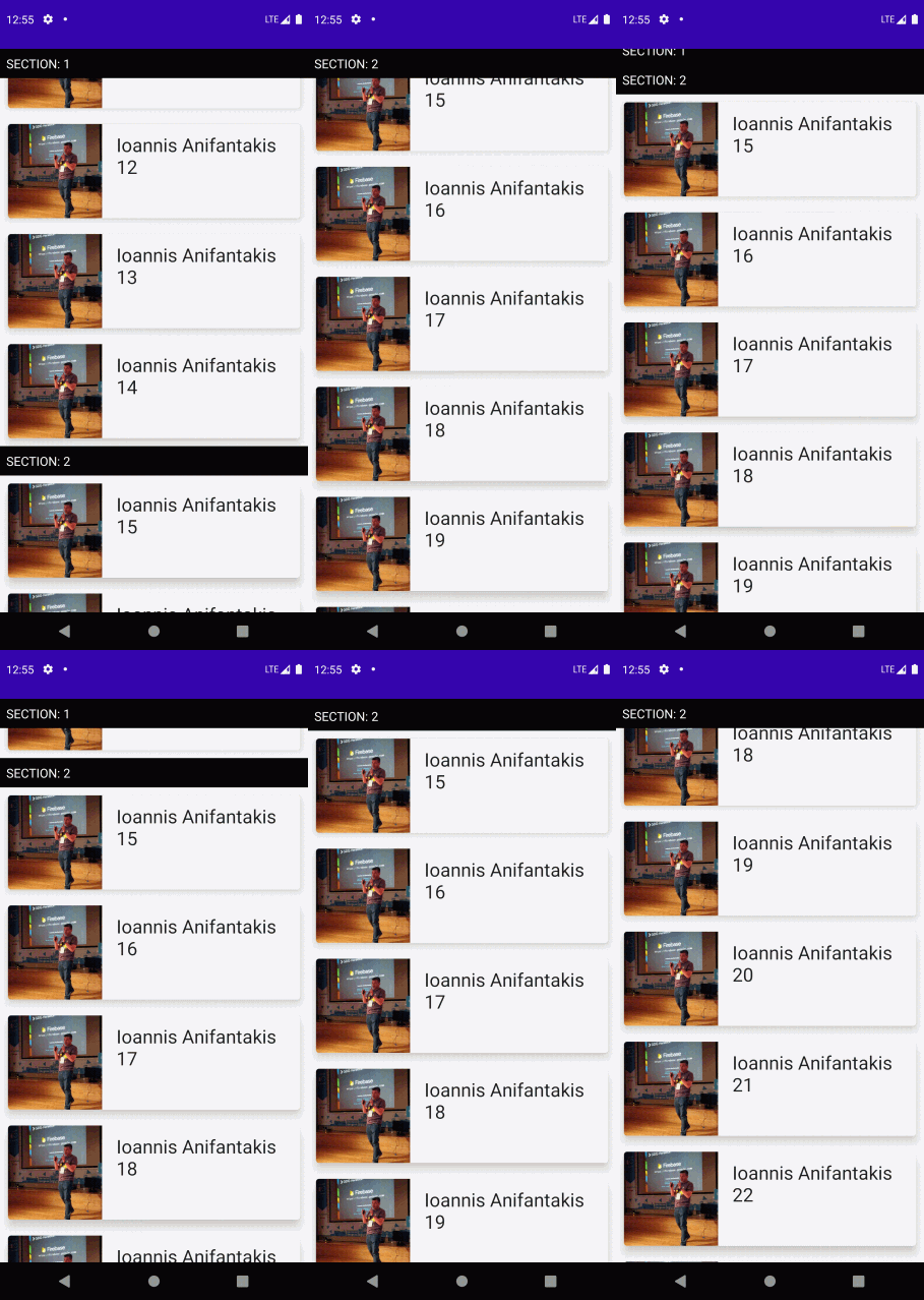
Demo 5: Adding Sticky Header to Demo4 code
Using sticky headers in the past was not easy. Now with Jetpack Compose, this is a no brainer anymore!
Here we will transform the bellow piece of code of Demo4 from…
@Composable
fun LazyColumnClickableAdvDemo(persons: List<Person>, selectedPerson: (Person)->Unit){
    LazyColumn(){
        items(
            items = persons,
            itemContent = {
                ListItem(
                   person = it,
                   selectedPerson = selectedPerson
                )
            }
        )
    }
}
…to the following piece of code and Sticky Header will be implemented!!!
@OptIn(ExperimentalFoundationApi::class)
@Composable
fun LazyColumnClickableAdvDemo(persons: List<Person>, selectedPerson: (Person)->Unit){
    val grouped = persons.groupBy{it.section}

    LazyColumn(){
        grouped.forEach { (section, sectionPersons) ->
            stickyHeader {
                Text(
                    text = "SECTION: $section",
                    color = Color.White,
                    modifier = Modifier
                        .background(color = Color.Black)
                        .padding(8.dp)
                        .fillMaxWidth()
                )
            }

            items(
                items = sectionPersons,
                itemContent = {
                    ListItem(
                       person = it,
                       selectedPerson = selectedPerson
                    )
                }
            )
        }
    }
}
I put all changes in bold, so you can easier spot them.
How do Sticky Headers work?
Sticky Headers represent groups of data.
Every record in our dataset contains a section number, so to have sticky headers based on sections, we should group by our persons per section.
So the idea is to break the single large list of persons, into a number of smaller person lists, per section.
We can represent that with a Map<Int,List<Person>> where each Int key is a section number.
We can break our List into a Map of smaller lists, grouped by section id with the following line val grouped = persons.groupBy{it.section}
Then we can iterate our grouped Map, and for every map key we add a stickyHeader, and then at the header’s items block we add the List<Person> that corresponds to that map’s key.
Please note that because the sticky header feature is currently experimental, you need to add an experimental annotation at your composable function.
@OptIn(ExperimentalFoundationApi::class)


